How to turn your CV into a modern visual CV (infographics, design and UX)

A well-designed visual CV can make you stand out from dozens of other candidates. If it’s poorly designed, it could get you rejected for looking unprofessional. The line between the two is thinner than it seems. If you work in design, marketing, creative fields or similar areas, a visually striking CV can be your best calling card. But it has to work, not just look good.
When does a visual CV make sense?
Not all sectors value a visual CV in the same way. In graphic design, advertising, architecture, UX/UI or digital marketing, you’re expected to showcase visual skills. Your CV is almost part of your portfolio.
Conversely, in law, finance, public administration or medicine, a highly visual CV can work against you. It’s interpreted as a lack of seriousness or ignorance of the sector’s conventions.
In intermediate sectors such as human resources, communications or project management, a modern yet understated design can work. No elaborate infographics, but rather a clean and attractive visual structure.
Before you set about creating a visual CV, ask yourself: is this appropriate for my industry? Will it help or hinder me? If in doubt, it’s better to err on the side of caution.
Elements of a good visual CV
An effective visual CV uses design to enhance communication, not merely to decorate. Every visual element must serve a purpose: to highlight important information, make the text easier to read, or present data in a more understandable way.
Visual hierarchy is essential. The eye must know where to look first, second, third. You use size, colour, position and spacing to guide the reader through your professional story in a logical way.
Colour must be used with intention. One or two main colours is sufficient. Too many colours create chaos. Colour can differentiate sections, highlight key information or simply give the document personality without distracting.
Typography also communicates. A modern font conveys something different from a classic one. But never use more than two or three different fonts. Any more than that is visual clutter.
Icons can replace words and make your CV easier to scan. A telephone icon next to your number, an envelope next to your email, a location pin next to your city. Small details that make reading quicker.
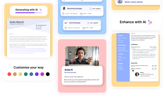
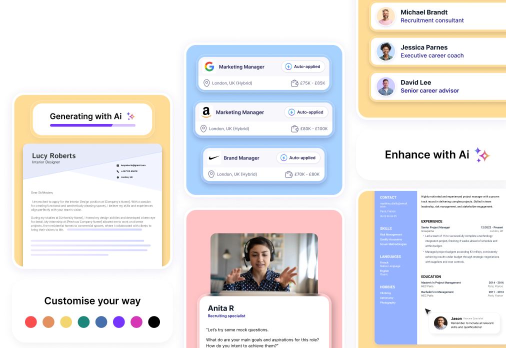
Infographics can present complex data in a simple way. Your career progression on a visual timeline, your skill levels in charts, your education in a clear diagram.
How to use infographics without overdoing it
Infographics in CVs are useful when they genuinely add clarity. A timeline of your career path can be more visually clear than a text-based list. A chart of your language skills can convey your level more quickly than writing it out.
But infographics can be counterproductive. Those percentage bars for technical skill levels look nice but are imprecise. What does 80% in Photoshop mean?
Compared to what? It’s clearer to write “Photoshop: advanced” or “Photoshop: 5 years of professional use”.
Decorative graphics that don’t provide useful information just take up space. If your graphic doesn’t convey something relevant faster or better than words, you don’t need it.
Remember also that many ATS systems don’t read infographics. If your work experience is only in visual format, the system may not detect it. There should always be legible text in addition to the design.
UX design applied to your CV
The principles of UX (User Experience) design apply perfectly to a CV. Your recruiter is your user, and you want their experience reading your CV to be smooth and enjoyable.
Start with the visual flow. Where does the eye start reading? Usually at the top left. Put your most important information there. Then guide the eye downwards and to the right using clear hierarchies.
Spacing is critical. Overly cramped content strains the eyes. Too much space wastes the document’s potential. Find the balance where each section has breathing room but you make the most of the available space.
Legibility over aesthetics. If your design looks lovely but makes the content hard to read, you’ve failed. Function is more important than form, always.
Use appropriate contrasts. Light grey text on a white background may look modern but strains the eyes. Ensure everything is easily readable even if printed in black and white.
Create clearly distinct sections. The recruiter must be able to jump straight to work experience, education or skills without having to figure out where everything is.
Tools for creating visual CVs
You don’t need to be a professional graphic designer. There are tools that make it easy to create decent visual CVs.
Canva offers editable CV templates with a variety of designs. You can customise colours, fonts and layout. It’s intuitive even if you have no design experience.
Adobe Spark or Adobe InDesign if you’re a bit more advanced. InDesign gives you total control but requires a learning curve.
Figma is another powerful and increasingly popular option. It has a learning curve, but the result can look very professional.
You can also use AI to create your visual CV. Some tools generate designs based on your content and preferences, although you’ll then need to tweak them to make them truly your own.
If you really don’t have an eye for design, consider hiring a designer to create your CV. It’s an investment that can be well worth it if you’re in a field where visual design matters a great deal.
What to avoid in a visual CV
The biggest mistake is prioritising design over content. Your CV may be a visual masterpiece, but if it doesn’t clearly communicate your experience and achievements, it’s useless.
Another common mistake is using very popular templates without customising them. If a hundred people use the same Canva template with the same colours, none of them stand out. Always customise.
Low-quality or inappropriate photos ruin any design. If you include a photo, make sure it’s professional, high-resolution, with a neutral background.
Avoid an excess of decorative elements. That background with complex textures, those ornate borders, those graphics that add nothing. Less is more.
Don’t use too much space on design at the expense of content. Your CV must still contain all the relevant information. The design helps to convey it, not reduce it.
Formats and compatibility
A visual CV is usually a PDF. This ensures it looks the same on any device. Word can throw your entire layout off depending on the version the person opening it uses.
But remember the issue with ATS systems. If the company uses automatic filters, your visual CV might not get through. For such cases, you also need a plain text version without complex design, which the systems can read.
One strategy is to have two versions: a visual one to send to direct contacts, small companies, or when you know a specific person will be viewing it. And a more standard version for applications to large companies that are likely to use ATS.
Make sure your CV looks good on screen and on paper. Try printing it out. Sometimes colours look different in print, or certain details that work on screen are lost on paper.
The online version
Consider creating an online version of your visual CV. A personal website or an interactive PDF with clickable links to your portfolio, LinkedIn and projects.
This is particularly valuable for creative or digital profiles. You can link directly to work you’ve done, showcase case studies, or include videos or presentations.
If you work in UX/UI, your CV page can be a demonstration of your skills in itself. The design, navigation and user experience of your own presentation speak to your ability.
For developers, including links to your GitHub, live projects or open-source contributions is essential.
Balancing creativity and professionalism
The challenge of a visual CV is to be creative without losing professionalism. You want to stand out, make a positive impression, and show your personality. But you also need to convey that you are competent, reliable, and capable of doing the job.
A good visual CV achieves both. It has personality but isn’t over-the-top. It’s modern but not a passing fad that will be outdated in six months. It shows creativity but with restraint and purpose.
Draw inspiration from good examples in your sector. Look at what the professionals you admire are doing. Don’t copy, but learn from what works.
Ask for feedback before using it. Show your visual CV to colleagues, mentors or people in the industry. They’ll tell you if it works or if you’ve gone too far.
When to use the visual version vs. the standard one
You don’t need to choose between a visual CV and a standard one. You can have both and use each one depending on the context.
For networking, events, direct contacts, small or creative companies: use the visual version. It’s more memorable and showcases your design skills.
For online applications to large companies, conservative corporations, or when they specifically request a standard format: use the text version.
For email submissions when you’re unsure: ask. Or send both versions, giving them the option to choose which one to review.
Keep both versions up to date. It would be absurd to have an impressive but outdated visual CV and a standard one that’s up to date. Every time you add experience or achievements, update both.
The visual CV as a portfolio
For certain roles, the visual CV is almost a miniature portfolio. You don’t just list your experience; you demonstrate your ability by executing it within the document itself.
A graphic designer who submits a poorly designed CV loses all credibility. One who submits a flawless design demonstrates their ability before saying a word.
The same applies to UX designers, art directors, architects and web designers. Your CV must be proof that you can do what you claim to be able to do.
Turning your CV into a modern visual portfolio can open doors for you, especially in creative and digital sectors. But it only works if the design serves the content, not the other way round.
A good visual CV communicates your experience more clearly and memorably than a traditional one, showcases your design skills in action, and sets you apart from candidates with standard documents. But remember that not all contexts value it equally. Know your industry, adapt to what they’re looking for, and create something that’s genuinely your own. The best visual CV is the one that makes the recruiter think, “This person understands what we do and also knows how to communicate it visually.” If you can achieve that, you’ve already come a long way.